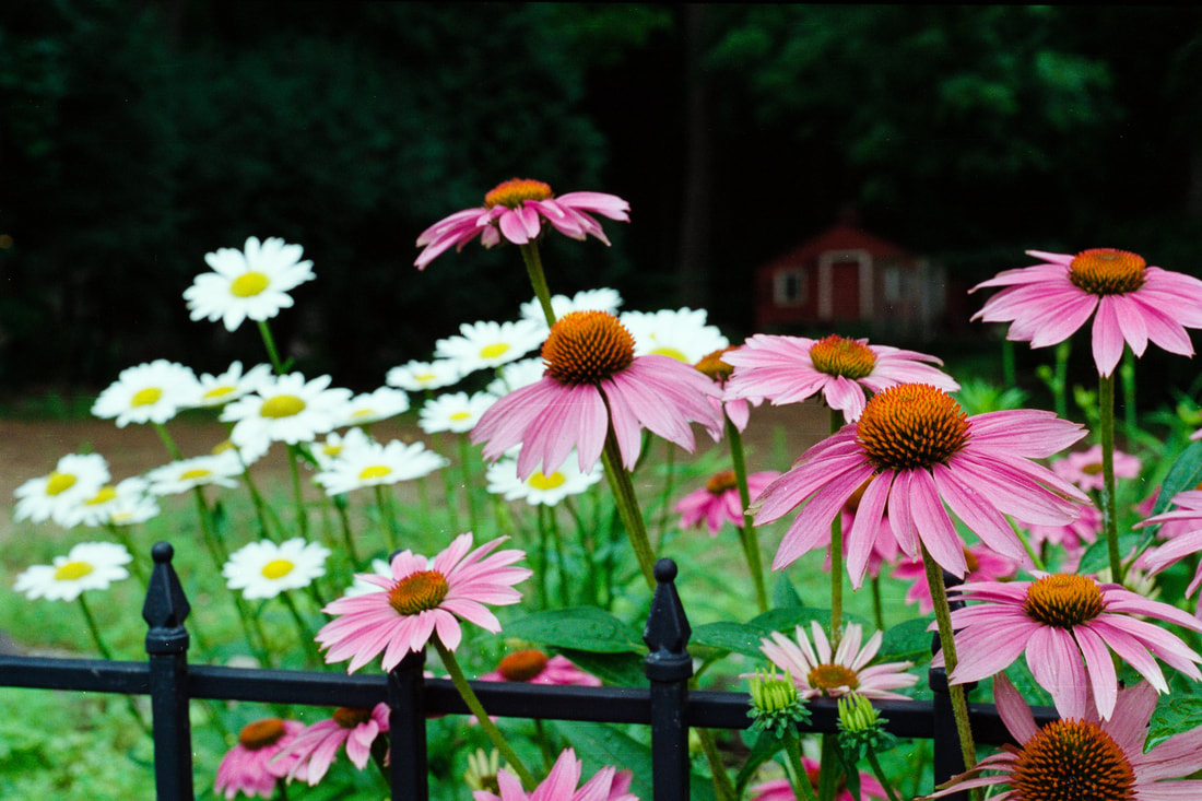
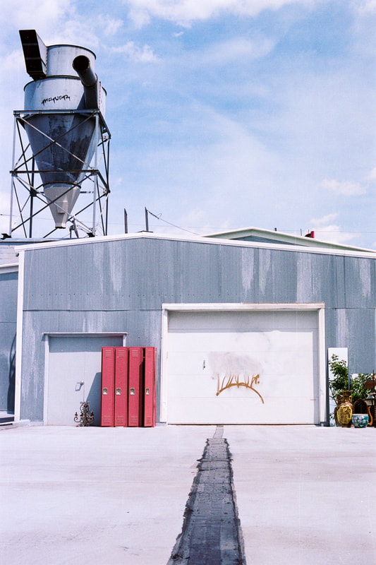
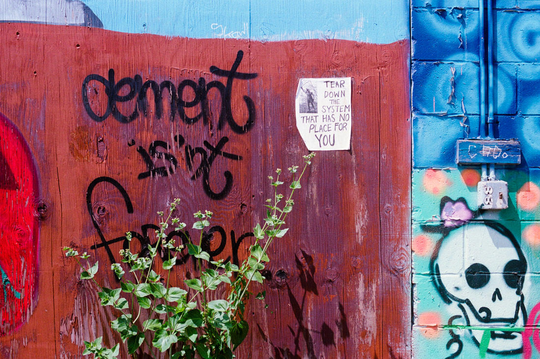
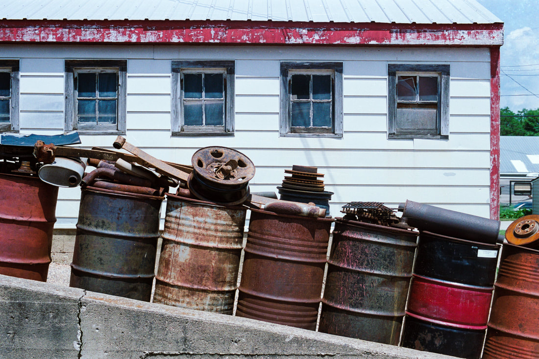
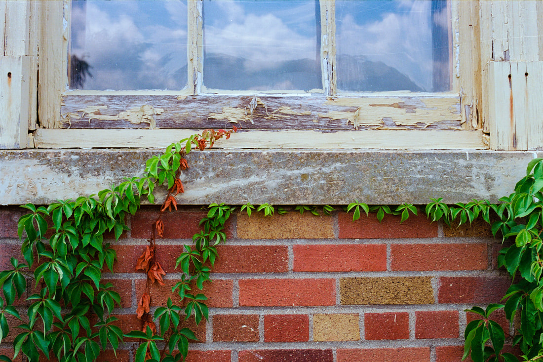
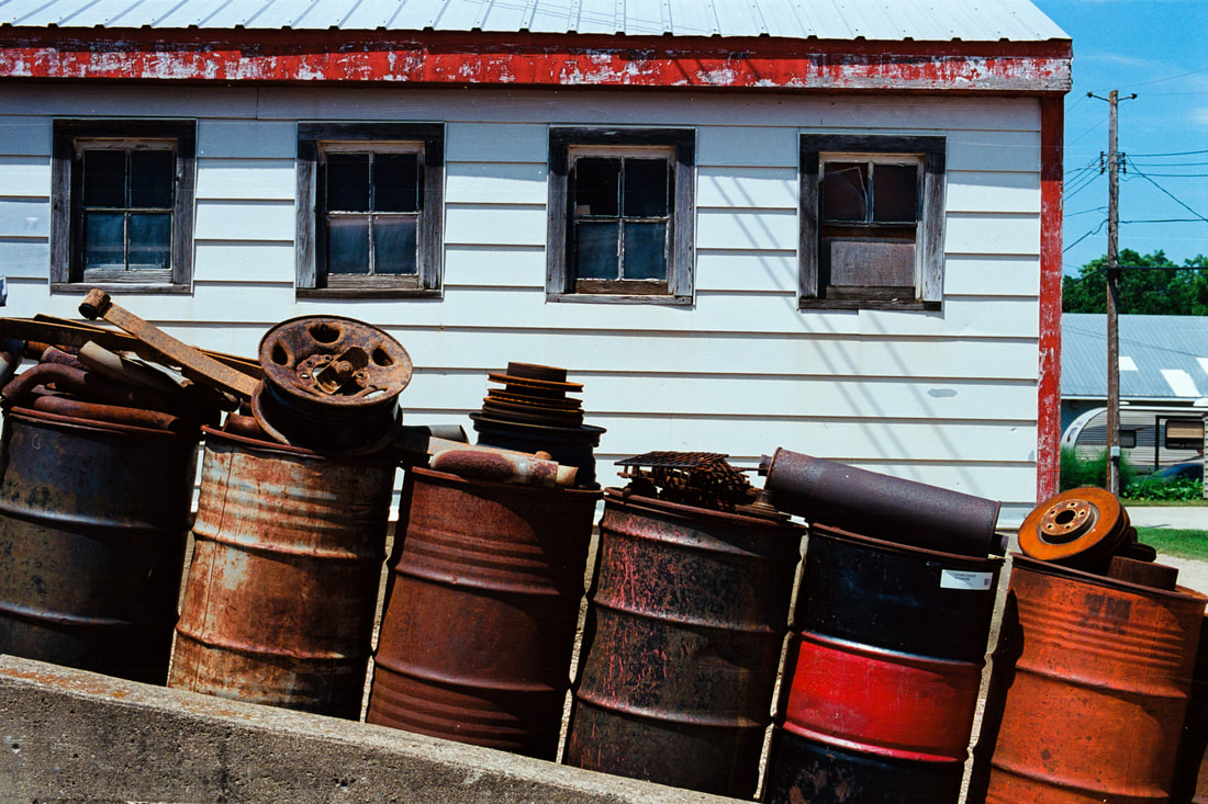
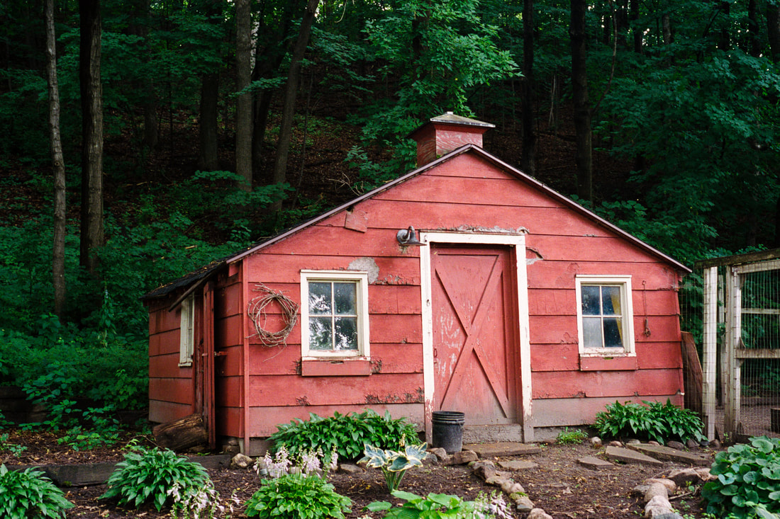
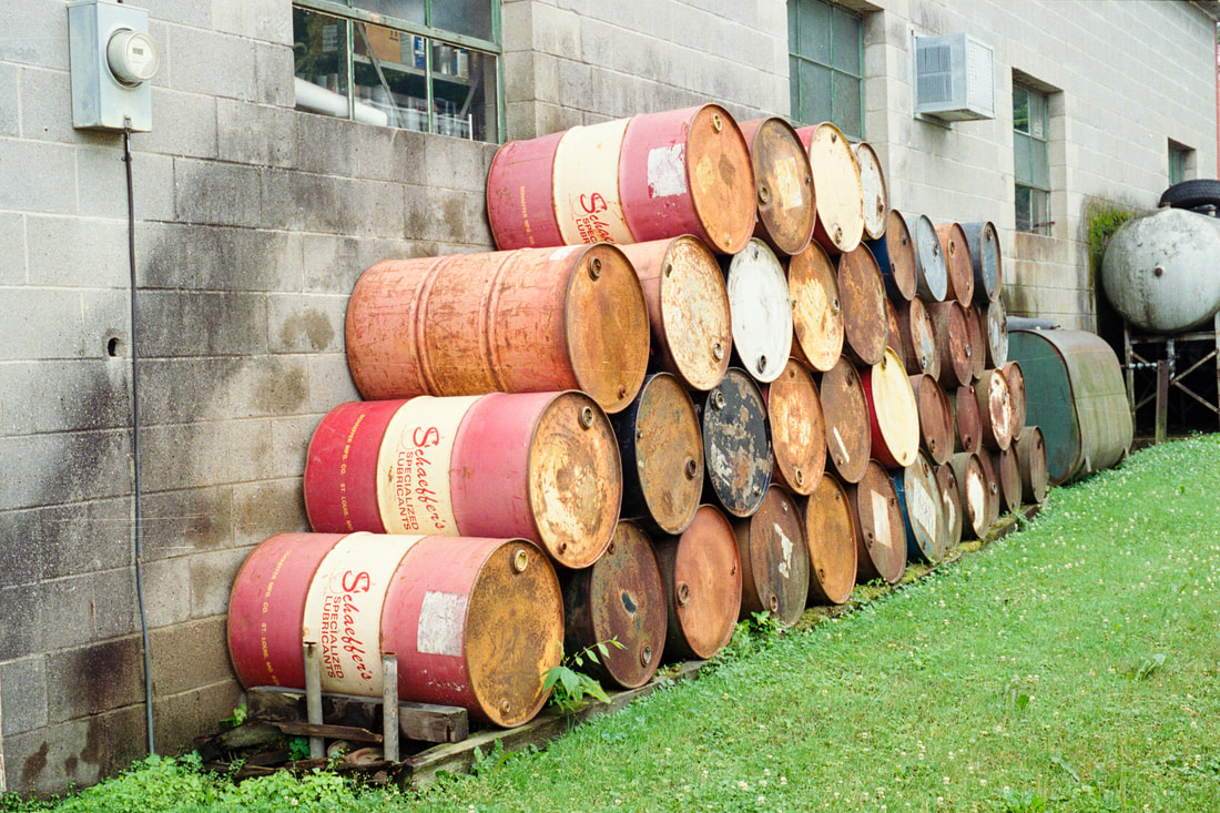
 Hen House Cone Flowers: Portra 400 Since coming back to film photography a year and a half ago, my color film of choice has been Kodak Portra 400. Recently I decided to test out a few other Kodak color film stocks to see what I've been missing. The films I tried out alongside Portra 400 are Portra 160, Ektar 100, and ProImage 100. Portra and Ektar are the premium priced films in this bunch. Kodak ProImage 100 is substantially less expensive, so I was curious to see how it would fair against the others. I love Portra 400's understated saturation and warm tones. It just sees the world the way I do. I expected a similar look and feel with Portra 160, and that's what I got. Ektar is supposedly the closest you can get to Kodachrome colors these days. It certainly had punchier reds. I actually preferred the warmer color palette of ProImage 100 to Ektar. I certainly like the fact that it's way less expensive too. I shot these four rolls during July, using my Nikon F3HP and Nikon FE2, both fitted with 50mm prime lenses. All four rolls were processed at West Photo in Minneapolis. The images in the gallery above were scanned on my Plustek OpticFilm 8200i using SilverFast software, with the resolution set to 3600 dpi. I selected the Negafix option in SilverFast. In almost all cases, I did not turn on color cast correction. I found that all four film stocks were easy to scan. None of them suffered from cupping, which made it easy to get the film to lay flat in the holder.
All post processing was done in Lightroom Classic. I did no color grading. I applied a medium contrast curve to all images. I also set the white and black points and added a wee bit of clarity and vibrance (6 for both). On the window images I added a bit of dehaze to reduce glare. Sharpening was left at the Lightroom default of 40. I don't really worry about grain, so I haven't evaluated these images for that. What I do care a lot about is the color palette. I tend to prefer a warmer color palette. That is the key reason I haven't tested any Fuji films, as I've found through the years that the Fuji color palette is much too cool for my taste. I also care about saturation and contrast. I prefer less aggressive rendering on both those factors. So after all this experimentation, you might ask if I've changed my mind about my favorite color film. The short answer would be no, I still prefer Portra 400, but I could see myself shooting more Portra 160 during the long summer days. And if I'm trying to stretch my film budget, I wouldn't hesitate to shoot Kodak ProImage 100. As far as Ektar is concerned, I find the color palette and contrast are just too punchy for my style. But if that's your thing, Ektar delivers it in spades.
0 Comments
|
AuthorTom Northenscold Archives
December 2022
Categories
All
|


 RSS Feed